Source: This is an excerpt from the course 'YouTube Storytelling: Far Beyond Retention', which teaches you the storytelling strategies I've used to help YouTubers make 1M+ view videos.
How to interpret retention graphs
Here is my personal approach to understanding the retention graph. It's an incredibly useful tool for improving your videos, because I believe it is the single best quantitative tool for understanding how audiences objectively react to your content.

Many may think of graphs in terms of dips and spikes, but I want to give you a re-conceptualised approach that I feel makes retention graphs much more useful. By the end of this article, you'll see exactly what I mean!
Quick summary

Gradient Analysis
It's often better to observe the gradient of individual segments. The reason I prefer this is because gradients are always relative to each other (meaning that you don't have to worry about a lot of the complexity that comes with interpreting it), and that they are better for understanding how a particular segment is actually performing than spikes or dips. A steeper gradient means more people are choosing to leave.

The simple way I do this is to take a screenshot, paste it into a tool like Photoshop or Figma or Sketch, and then calculate vertical pixels divided by horizontal pixels.
Of course, if you don't really care about precision as much, that's totally okay. A rougher way to do it is draw straighter lines that seem to broadly match the start and end of segments, which is a lot quicker in practice. However, typically above a certain number of views, they may not be as easy to catch.
- A steep downwards gradient means lots of people are dropping off at once.
- A shallow downwards gradient means people are dropping off, but slowly.
- Gradients are often harder to appreciate than sharp spikes or dips, so it's important to actually do this.
A quick note on precision
If you care a lot about precision, then you can download the .csv of the retention graph.

No matter how long your video is, this will always be divided into 100 points, displaying the % of remaining audience at each of those points.
This has one rather important consequence. I first noticed this when I was getting a whacky 95% retention on my 2-hour long video for the first 0:30. I'm pretty good at storytelling, but not that good! I realized with the help of other strategist friends that it was because the 120 minutes was divided into 100 points. That meant that the percentages were only calculated every 1.2 minutes!
Spikes, Flats, and Dips

Spikes

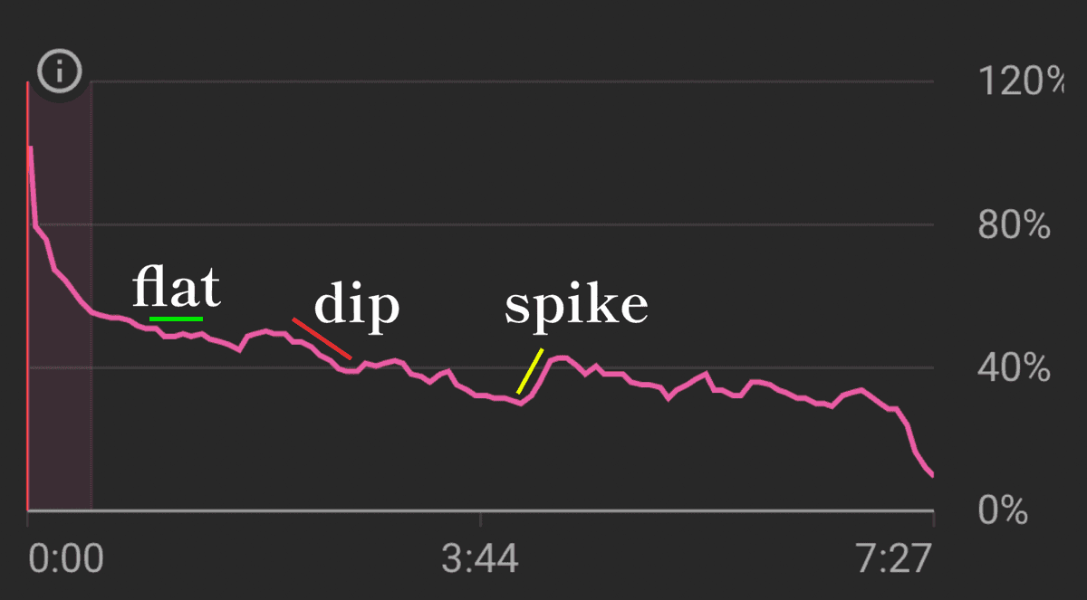
A spike is where the curve goes up, meaning viewers have come back to watch this segment. This does not necessarily mean "do more of this" in the video.
Bad reasons for spikes
Viewers are confused and need to rewatch a segment. Or viewers are skipping ahead to that spot, meaning they're ignoring the segment before it. This is especially common in videos with chapters, or after sponsorship segments that haven't been integrated well.
Good reasons for spikes
Something was so cool and clutch that viewers felt compelled to rewatch it. Spikes need to be interpreted in the context of what's happening in the script at that particular time.
Flats

Horizontal segments where the steepness of the graph is less than usual. This indicates that people are engaged and staying for this section. It's captured their attention.
Important Nuance
Keep in mind that how good this is needs context. Just because someone is watching a particular segment, does not mean they necessarily enjoy the video. It just means they're waiting to resolve whatever question they have on their mind. So if there's a big dip after a flat, it means that you held attention — but people didn't like the segment.
Dips

When a graph is steeper than usual across a section, it means that section isn't holding people's attention.
Don't Miss Subtle Changes
These steeper segments are not always so obvious. Look for subtle changes in gradient. YouTubers very often miss these, thinking they're nice and flat, but actually these segments are bad. I find a very useful exercise is to draw individual straight lines using a graphic design software, and if a line doesn't quite match up and you have to draw another line to make it fit the retention curve, then you've got a change in gradient.

Post-segmentation dips (segmentation loss)
In my work as a doctor, an interesting phenomenon that often happens is that when someone has a problem in a nerve, they don't feel it where the nerve is pressing. They feel it at the place the nerve is innervating. A herniated disc is the classic example, where someone can feel pain in their leg from something that's happening in the lower back.
So I was surprised to see this concept in one of the great editing books, In The Blink Of An Eye.
They gave an example where test screenings were done to see how people liked a movie, and often, those people hated the same parts of the movie that they were tested on. But when the authors really looked into it, the part that audiences hated wasn't actually the part that was bad. It was everything that led up to that part that caused it to fall apart.
Key Insight
Applied to YouTube retention chart analysis, a big dip after a segment can signal that the segment before the dip was bad. Not just what's said right before the dip. A post-segmentation dip is the psychological equivalent of "okay, got through that bit and that was boring, I've watched enough of this."
Shapes
Of course, there are more specific shapes that mean different things.


Subscribers and non-subscribers retention

The Subscribers and non-subscribers .csv reflects the fact that you can separate these two groups in YT Studio as well. You might want to do this if you're trying to understand how your video affects your non-core audience (e.g. new audiences) as opposed to those who are loyal to your channel.
From here, how do you improve retention?
Now that you know how to diagnose retention issues… how do you improve it?
- Improving scriptwriting
- Improve presentation
- Improve editing
The simple answer is: experiment and continue to learn both from data and learn from other people.